
GET ACCESS TO OUR AMAZING BLOG DIRECT TO YOUR INBOX
Get industry updates, tips, guides, training documents, white papers and much more direct to your inbox.
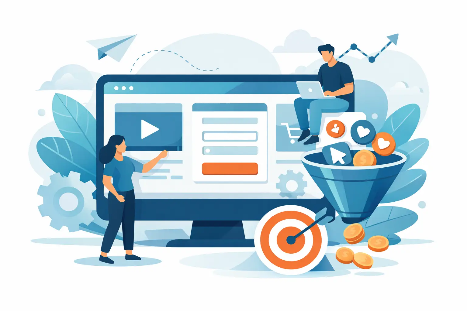
Most websites do not have a traffic problem. They have a conversion problem. If people are landing on your site from SEO, PPC or paid social and still not enquiring, buying or booking, this guide to conversion focused web design will help you see where the leaks usually are – and what to fix first.
Conversion-focused design is not about making a website look busy, clever or trend-led. It is about reducing friction, building trust and guiding the visitor towards the next sensible step. That might be a phone call, a form fill, a brochure download or a purchase. The right approach depends on your sales cycle, your audience and the quality of traffic coming in. A local dentist, a law firm and an e-commerce brand will not need the same page structure, even if they all care about better ROI.
What conversion focused web design really means
A conversion focused website is built around commercial intent. Every key page has a job to do, and the design supports that job instead of distracting from it. Good design still matters, of course. But visual polish on its own does not produce leads.
The real question is simple: when the right person lands on the page, do they immediately understand what you offer, why they should trust you and what they should do next?
If the answer is unclear, performance drops. Visitors hesitate when headlines are vague, navigation is crowded, forms ask for too much, or proof points are buried halfway down the page. In competitive sectors, that hesitation is expensive. You have already paid for the click or invested time to earn the ranking. The website should carry its share of the workload.
Start with intent, not aesthetics
One of the most common mistakes in web projects is starting with colours, layouts and inspiration boards before defining the conversion path. Design choices should follow user intent.
A visitor from a branded search campaign often behaves differently from someone arriving via a broad informational blog post. One may be ready to speak to sales. The Other may need reassurance, education and a softer next step. That is why high-performing websites map page intent to traffic source. It is also why a homepage should not try to do everything at once.
For service businesses, this usually means building focused landing pages around specific offers, industries or locations rather than pushing all traffic to a generic page. For e-commerce, it may mean reducing distractions on high-intent product and category pages. In both cases, relevance wins.
The foundations of a conversion focused web design guide
There is no single formula, but the strongest sites tend to get the same fundamentals right.
Clear messaging above the fold
Within a few seconds, visitors should understand what you do, who it is for and what happens next. That means a headline with substance, supporting copy that removes ambiguity and a primary call to action that is easy to spot.
Too many businesses use vague lines about excellence, innovation or tailored solutions. Those phrases rarely answer the buyer’s real question. Be specific. If you help manufacturers generate qualified leads, say that. If you provide emergency roofing services in a defined area, say that too.
Strong calls to action without overkill
Calls to action need visibility, but they do not need to be shouted from every corner of the page. Repetition helps when it follows the user’s reading flow. Clutter does the opposite.
A good rule is to offer one primary action and, where useful, one lower-commitment secondary action. For example, a law firm might pair “Request a consultation” with “Speak to an expert”. A B2B software business might use “Book a demo” and “See pricing”. The balance depends on buyer readiness.
Trust signals placed where doubt appears
Trust is not a separate section you add near the footer and forget about. It should appear where a reasonable prospect is most likely to question your claims.
That includes reviews near conversion points, accreditations near contact forms, case study outcomes beside service claims and transparent process details where commitment feels high. If you operate in regulated or competitive sectors, this matters even more. Buyers want to know they are dealing with a credible operator before they hand over details.
Navigation that helps rather than distracts
A bloated navigation often reflects internal politics rather than user needs. Every extra option creates another chance to drift away from the conversion path.
That does not mean hiding useful information. It means prioritising the journeys that drive revenue. Keep core services, industries, about, proof and contact easy to find. For landing pages tied to paid campaigns, stripping back the menu can often improve response rates, although brand familiarity and campaign type will influence how aggressive you should be.
Friction is usually the silent killer
Most underperforming websites are not failing because of one dramatic issue. They are losing conversions through small points of friction that add up.
Slow load times are the obvious one. If pages lag, users leave. But friction also shows up in weaker ways: a form that asks for budget too early, mobile buttons that sit too close together, copy that feels corporate rather than human, or layouts that bury the key action below several scrolls of filler.
Mobile deserves special attention. For many businesses, the majority of traffic now comes from mobile, but conversion paths are still designed with desktop in mind. That leads to pages that look acceptable on a phone but feel awkward to use. Check thumb reach, field length, click-to-call visibility and whether the most important information appears early enough.
If your site attracts quality traffic but conversion rates lag, friction should be one of the first places you investigate.
Good design supports the full funnel
A practical guide to conversion focused web design should not only focus on the final click. It should recognise that different visitors sit at different stages of decision-making.
Top-of-funnel visitors may need educational content, category explanation and proof that you understand their problem. Mid-funnel visitors often need comparison points, process clarity and stronger evidence. Bottom-of-funnel visitors need reassurance, speed and a direct route to convert.
This is where integrated thinking matters. SEO pages may pull in broader intent searches. PPC landing pages may target higher commercial intent. Paid social may create demand before branded search picks it up later. If each page is designed in isolation, performance becomes patchy. When web design aligns with channel intent, the user journey feels much clearer and attribution becomes easier to understand.
Measure what matters
If you cannot see where conversions come from, web design decisions become guesswork. Good reporting should show not just headline conversions, but which pages, devices, channels and campaigns are producing them.
That visibility helps you spot patterns quickly. Perhaps organic traffic converts well on service pages but poorly on blog-led journeys. Perhaps paid social drives strong engagement but weak form completion on mobile. Perhaps one location page outperforms the rest because its message is more specific. Those insights are where design improvements become commercial improvements.
It is also worth separating micro-conversions from revenue actions. Time on site and scroll depth can be useful supporting signals, but they are not the same as qualified enquiries or sales. Keep your eye on the metrics that affect growth.
When redesigning is the wrong first move
Not every site needs a full rebuild. Sometimes the smarter commercial decision is to improve key templates, landing pages or mobile UX before committing to a large-scale redesign.
A full rebuild can solve structural problems, but it also introduces risk. Rankings can shift, tracking can break and internal teams can spend months debating details that have little effect on conversion. If the site already has authority and traffic, a targeted CRO-led approach may produce faster gains with less disruption.
That is often the better route for growing businesses that want measurable improvement without pausing momentum. Test the high-impact fixes first. Then decide whether the broader platform and design system need to change.
What better performance usually looks like
When a website is properly aligned to intent, the difference is rarely subtle. Bounce rates fall on key pages. Lead quality improves because messaging filters out poor-fit enquiries. Sales teams spend less time chasing weak prospects. Paid media becomes more efficient because landing pages convert more of the traffic you are already buying.
This is why conversion-focused web design should not sit in a silo. It affects SEO value, PPC costs, social campaign performance and the confidence decision-makers have in marketing as a growth driver. At Finsbury Media, that joined-up view is what turns websites from digital brochures into working assets.
The best place to start is usually the simplest: look at your highest-intent pages and ask whether they make the next step easy, credible and obvious. If not, that is your opportunity. Growing your business should feel clearer than it does now.